Local Time: A Challenge for Visualization with Johanna Drucker, UCLA

Zoom Meeting

Each year, the Brown Institute sponsors talks that explore the intersection between media and technology. This year we have three virtual presentations lined up, each challenging us to think about data and computation in new ways. Each talk is by researchers outside of journalism, and yet we have a great deal to learn from their

Data Feminism with Catherine D’Ignazio, MIT and Lauren Klein, Emory University

Zoom Meeting

Each year, the Brown Institute sponsors talks that explore the intersection between media and technology. This year we have three virtual presentations lined up, each challenging us to think about data and computation in new ways. Each talk is by researchers outside of journalism, and yet we have a great deal to learn from their

Roles for Computing in Social Justice with Rediet Abebe, Harvard and UC Berkeley

Zoom Meeting

Each year, the Brown Institute sponsors talks that explore the intersection between media and technology. This year we have three virtual presentations lined up, each challenging us to think about data and computation in new ways. Each talk is by researchers outside of journalism, and yet we have a great deal to learn from their
C + J Symposium 2021: Data Journalism in an Expanded Field

Online Webinar NY

C+J 2021 — A virtual gathering From the outset, 2020 looked like it would be a year of data and computation in journalism. Think of the events that were planned — from the 2020 Presidential Election to the decennial census, to the Summer Olympics, to the 50th Anniversary of Earth Day. Each of these stories

Computation + Journalism Conference

Brown Institute at Columbia 2950 Broadway, New York, NY, United States

News outlets rely on computation to tell some of the biggest stories of our time. They collect data when official sources have not. They build statistical models to uncover disparities, previously ignored. And they craft visualizations to reveal new dimensions to a story. Some newsrooms have expertise in-house to produce this work, while others depend

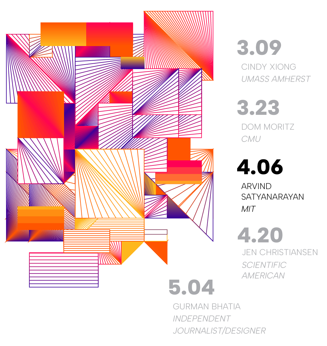
Lectures in Data Visualization: Arvind Satyanarayan

Brown Institute at Columbia 2950 Broadway, New York, NY, United States

Intelligence Augmentation through the Lens of Interactive Data Visualization The rise of large language models has brought new urgency to the future of human + machine partnerships. In this talk, I will use three research threads on interactive data visualization to better understand the balance between automation and augmentation. First, I will describe how new

Data Visualization Workshop with The Pudding

Brown Institute at Columbia 2950 Broadway, New York, NY, United States

Graphical (or pictorial) presentations of data have become an almost essential part of journalistic practice. Data visualization helps us see patterns in data and is an important tool for finding stories. Over the past decade, major outlets including The New York Times, Washington Post, and Reuters are publishing data visualizations that push the idea of

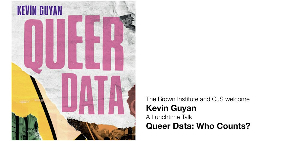
Queer Data: Who Counts?

Brown Institute at Columbia 2950 Broadway, New York, NY, United States

Kevin Guyan will join CJS for a talk on "Queer Data". Guyan, soon to be a Fellow at the University of Edinburgh, has written extensively on data collection and LGBTQ communities. The first step in so many reporting projects is a data set, and even our own US Census Bureau has proposed asking questions about Sexual Orientation and Gender

Human Rights Reporting: A Focus on Journalism and AI

Brown Institute at Columbia 2950 Broadway, New York, NY, United States

Join us for this special panel which will focus on global reporting on human rights, as defined by the Universal Declaration of Human Rights, within the evolving landscape of AI and the challenges and opportunities it presents. Delving into the influence of AI in international media and how the technology can be leveraged for human

Data Visualization Workshop with The Pudding

Brown Institute at Columbia 2950 Broadway, New York, NY, United States

Graphical (or pictorial) presentations of data have become an almost essential part of journalistic practice. Data visualization helps us see patterns in data and is an important tool for finding stories. Over the past decade, major outlets including The New York Times, Washington Post, and Reuters have been publishing data visualizations that push the idea