On Friday May 5 and Saturday May 6, the Brown Institute will host its final Transparency Series events — this time we’re presenting data visualization!
Join Manuel Lima on May 5th at 5pm for a fascinating tour through millennia of circular information design in architecture, urban planning, fine art, design, fashion, technology, religion, cartography, biology, astronomy and physics in a visual feast for infographics enthusiasts. From Venn diagrams and early celestial charts to the trefoil biohazard symbol and Target’s corporate logo, Lima provides a history of humanity’s long-lasting obsession with all things circular and a unique taxonomy of the many varieties of circle diagrams.
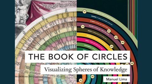
In addition to the presentation, Lima will be selling and signing his latest work, ‘Book of Circles’. Registration is not required to attend the event.
Bio for Manuel Lima: A Fellow of the Royal Society of Arts and nominated by Creativity magazine as “one of the 50 most creative and influential minds of 2009,” Manuel Lima is the founder of VisualComplexity.com, Design Lead at Google, and a regular teacher of data visualization at Parsons School of Design.
Manuel is a leading voice on information visualization and has spoken at numerous conferences, universities, and festivals around the world, including TED, Lift, OFFF, Eyeo, Ars Electronica, IxDA Interaction, Harvard, MIT, the Royal College of Art, NYU Tisch School of the Arts, ENSAD Paris, the University of Amsterdam, and MediaLab-Prado Madrid. He has also been featured in various magazines and newspapers, such as Wired, the New York Times, Science, Nature, Businessweek, Creative Review, Fast Company, Forbes, Grafik, SEED, étapes, and El País.
Then on Saturday May 6th from 10am-5pm Mona Chalabi of The Guardian and Kenan Davis from the New York Times will lead a hands-on workshopon data visualization (registration is closed). Graphical (or pictorial) presentations of data have become an almost essential part of journalistic practice. Data visualization helps us see patterns in data, and is an important tool for finding stories. Also, outlets like The New York Times and The Guardian are publishing data visualizations that push the idea of story telling, creating new data-driven ways to inform and entertain. In this day-long workshop, Chalabi and Davis will review some basic data visualization skills–guiding you through the design process. You will add annotation layers and learn to exploit what’s unique about data. During the day, we will also help you think critically about visualizations, making you a better consumer of data graphics.
Bio for Mona Chalabi: Mona Chalabi is a data journalist. She is the Data Editor of The Guardian US and a columnist at New York Magazine. As well as co-producing a four-part documentary series about vaginas, Mona has written for TV shows on National Geographic, the BBC and VICE. In 2016, Mona’s data sketches were commended by the Royal Statistical Society. The drawings, which are designed to make numbers more relatable, can be viewed on her Instagram account. Before getting into journalism, Mona worked in the nonprofit sector, first at the Bank of England, then Transparency International and the International Organization for Migration.
Bio for Kenan Davis: Kenan Davis is an Assistant Graphics Editor at the New York Times. Previously, he was the head of interactive for the Guardian US. And before that, he was the coordinator of the Digital Media program at the Columbia Journalism School, where he taught multimedia storytelling and web design.