
Seeing the locations mentioned in your news stories on a map provides strong signals about the communities and topics you prioritize.
Editor’s Note: This post was co-written and edited by Ana Méndez, Special Projects Editor at The Lenfest Local Lab @ The Inquirer; Faye Teng, UX Designer at The Lenfest Local Lab; and Michael Krisch, Deputy Director of the Brown Institute.
The role that locations play in local news stories is pronounced. In comparison to national or global news stories, locations that appear in local news are typically familiar to most readers by sight or by memory, and also provide deep cultural and social context for the information being shared. Each location in a story tends to be a signpost for the communities being represented, and by looking at those locations in aggregate one can quickly get broad signals about the people and communities that a newsroom covers most often, or doesn’t cover at all.
Among other things, these types of signals are what The Inquirer and Temple University researchers were looking for during a content audit launched in the wake of an offensive Inquirer headline published in June 2020. The newsroom sought out Temple’s help assessing their published work for weaknesses in cultural competency and representation across communities. The research team wanted to find out how often a wide range of people and perspectives were included in coverage that reflected the lives of city and suburban residents across the region. Researchers interviewed employees about their reporting process and also analyzed coverage trends to unearth who was represented in stories and how community life and community values were portrayed.
For the past two years, the Brown Institute has partnered with the Lenfest Local Lab, a multidisciplinary product and user experience innovation team supported by The Lenfest Institute for Journalism. Through this partnership, we had built a tool that uses a mix of natural language processing (NLP), deep learning, and geolocation techniques to scan news stories, identify the locations that are mentioned, and then plot them out on a map saving newsrooms a ton of time manually coding or tagging locations.
Since the Lab has always collaborated closely with The Inquirer since our start in 2018, it was a natural fit to apply our location model to the thousands of stories that would be audited by Temple and enhance the analysis. This would provide an opportunity to test our technology with real story data and also start to prove or disprove its potential to support geographic equity analysis and reveal blindspots.
The Philadelphia Inquirer’s Geographical Content Audit
After passing the more than 3,000 stories from the audit through our mapping tool, it identified 8,758 locations. From there we created three separate maps that provided differing lenses on the geographic representation of The Inquirer’s coverage during the audit period. Below are insights as they appeared in a joint presentation of the audit findings to The Inquirer newsroom in March 2020.
Methodology note: Temple University researchers looked at 42 random days of coverage during six random weeks between August 2019 and July 2020. More than 3,000 stories/elements were audited overall including information about 14,416 people who appeared in stories. The staff also conducted 46 in-depth interviews with staff.
Coverage by County
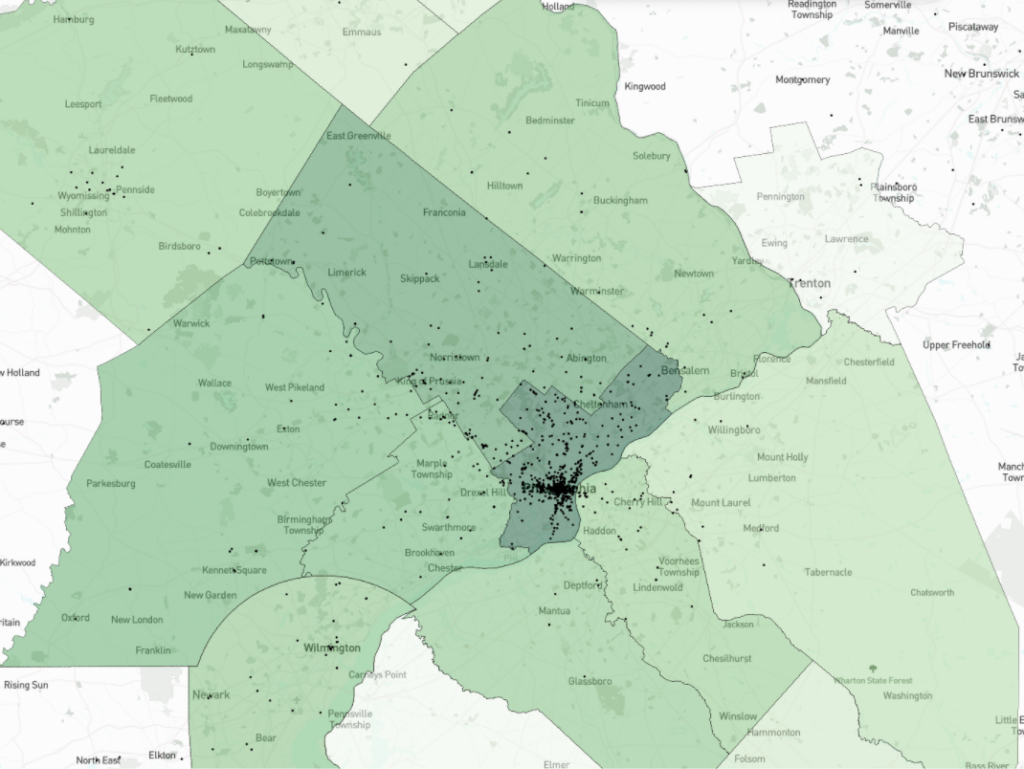
Counties included: Bucks, Chester, Delaware, Montgomery and Philadelphia Counties (PA); Burlington, Camden and Gloucester Counties (NJ). Each dot represents a story or stories that mention a location; the color shading corresponds generally with the density of locations mentioned in stories.
Our first observation was to show how coverage laid out across the eight counties in Pennsylvania and New Jersey that The Inquirer serves. This map shows that the highest concentration of locations mentioned in the stories, by county, were in Philadelphia and Montgomery Counties in Pennsylvania. Meanwhile the lowest concentration of locations mentioned were in Burlington County, New Jersey, a county located just on the other side of the Delaware River and which is home to many towns that locals consider nearby suburbs of Philadelphia.
This geographic insight alone could spark a discussion in the newsroom about communities and priorities, but we thought that one way to go deeper would be to look at the topics covered in each county. Our tool also allows you to adjust the date range to check for any observations related to seasonality, such as changes in coverage patterns in the summer, during a professional sports season or before or after something like the start of the pandemic.
During this part of the presentation we noted that showing this data on a map is meant primarily to provide a jumping off point for more nuanced discussions among subject matter experts about which topics are covered where, and why. The map doesn’t provide answers on its own, but it can help develop stronger questions about equity and representation in coverage.
Coverage by Neighborhood (Philadelphia)
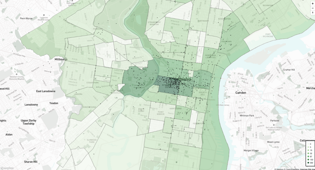
We also looked at the geographic distribution of coverage across neighborhoods in Philadelphia. This map showed that the highest concentration of locations mentioned in stories were in three main neighborhoods: Rittenhouse Square, University City and the Stadium District. For context, Rittenhouse Square is a high-income center city neighborhood with a shopping district, many restaurants and an iconic park. Meanwhile University City is an academic center of the city, home to Drexel University and the University of Pennsylvania. Lastly, the Stadium District is in South Philadelphia and houses the city’s major sports arenas.
After those three neighborhoods, there was a significant drop off in the concentration of locations mentioned.
A suggestion we had for deeper analysis was looking into how many of the locations mentioned in those neighborhoods are tied to institutions, such as cultural centers like the Philadelphia Art Museum, centers of city government like City Hall or court houses, as well as sports venues in South Philadelphia, and if so, how does that information help a newsroom analyze representation in coverage?
Coverage by Neighborhood, Race & Gender
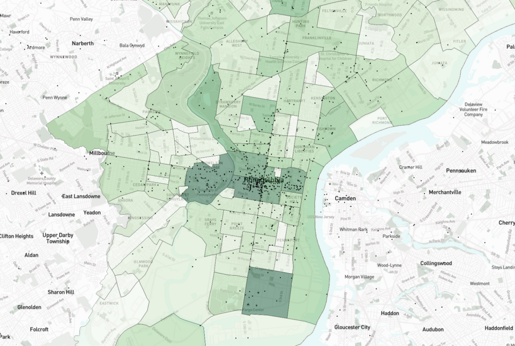
Finally, we offered an example of how this tool could be used to start looking at the intersection of geography, gender and race through the lens of community. It’s important to note here that Temple researchers manually assigned race and gender characteristics to people’s names who were mentioned in stories. Typically information about race and gender isn’t gathered about people who appear in Inquirer stories.
The map showed that for the distribution of stories that mentioned Black men, the highest concentration of locations mentioned were in two neighborhoods, University City and the Stadium District. Additionally the most frequent topics of those stories were college and professional sports.
It’s also important to note here that there are a variety of efforts underway, both within newsrooms and across research groups, to apply machine learning for the purpose of automating the identification of race and gender in text and images. To date, much of the research points to the shortcomings of using machines to apply this labeling. From the perspective of a newsroom, the harms associated with inaccurate classification could be severe. We’ve spoken with a few colleagues in the news industry who have attempted to build tools for automated identity tagging, and each has quickly reverted to manual entry to avoid harm. Meanwhile, the consensus among these groups is that it is best to collect this information during the time of reporting rather than retroactively. So while we had the opportunity to analyze the intersection of location, gender, and race thanks to the information gathered by the team at Temple University, we know that future analyses will require dedicated tagging efforts by reporters and editors. And while applying automation to identify gender and race is problematic, machine learning can play a critical role in scaling efforts of content auditing. This is particularly true for our effort in automating the extraction of locations from text.
Opportunities for geographic analysis
To quickly assess gaps in coverage: First and foremost this semi-automated mapping tool offers newsrooms the ability to quickly look at story locations in aggregate and point to where there may be gaps or inequities.
Philadelphia, for example, is one of many cities in the United States working to address documented systemic inequities. According to 2018 Census Bureau estimates cited in the Philadelphia City Council’s 2020 Poverty Action Plan, Philadelphia has the “highest overall poverty rate among the nation’s ten largest cities.” 2018 Census Bureau data also shows that 24.5% of the city’s population lives below the poverty line, nearly double the 13.1% national average. In addition, Philadelphia is also one of the most unequal cities in the country. According to the Inquirer’s own reporting, about 1 in 4 residents work low-paying jobs in the hospitality and retail sectors. We also know that in the wake of COVID-19, these issues will be exacerbated.
As we continue work on a tool to help analyze the geography of coverage, a main focus of ours will be the incorporation of census data as a backdrop for coverage analysis. From demographics to detailed housing and health information, the American Community Survey and Decennial Census data provide the opportunity to have nuanced conversations about how coverage reflects residents’ lives. For example, what is the concentration of coverage in areas of the city that are disproportionately affected by income inequality and inequity?
These statistics are top of mind at The Philadelphia Inquirer, and tools to quickly assess gaps in coverage can provide another data point driving efforts to improve the equity and representation of coverage.
To start creating benchmarks or goals for hyperlocal representation: It can be challenging for news organizations with large coverage areas to spread reporting resources across many neighborhoods and communities. In the Philadelphia area, this challenge shows up in one particular way when distributing resources to cover news events in the city and also in the surrounding suburbs. A mapping tool like this allows a newsroom to have ongoing, data-informed discussions about coverage in each community—city or suburban—as well as the topics covered and their frequency. This data can be a jumping off point for making strategic decisions around representation in news.
To monitor the geographic equity of coverage over time: While implementations of machine learning and natural language processing (NLP) in newsrooms have been developed to help optimize subscriptions and generate text, little has been done to automate tasks that support equity. Our tool can help newsrooms reduce the time it takes to perform geographic audits, expand their scope and identify problems faster.
Our hope is that our approach to building a tool like this could help newsrooms transition from manual, one-off equity audits to more routine, ongoing and computer-assisted processes that would make it easier for newsrooms to monitor and identify inequities in coverage and hold themselves accountable to ongoing progress. Audits that are only done once a year or once a decade, and only through the lens of one of two aspects of identity or community, risk offering outdated information by the time they’re complete or provide information that is misleading or too narrow.
Limitations
Considering intersectionality: The Inquirer commissioned the content audit as part of its efforts to become an antiracist news organization, and it frequently holds all-hands, company-wide meetings to share updates. During the Temple University team’s presentation of the audit findings to the company, a colleague of ours cautioned that any interpretations of antiracism that didn’t consider intersectionality gave her pause. While our tool was able to provide data about the intersection of locations, story topic and the race and gender of people mentioned in the story, this comment prompted us to think deeper. In response our former UX Designer, Faye, began researching how we might better address the concept of intersectionality in the mapping tool. The conversations her research led us to began to reveal many limitations.
Intersectionality was defined in 1989 by Kimberlé Crenshaw, a civil rights activist and legal scholar, in a paper for the University of Chicago Legal Forum describing ways in which Black women are subordinated. In general, the concept refers to the effects that multiple, overlapping forms of discrimination or disadvantage — including racism, sexism and classism — have on the experiences of individuals or groups. Our research helped us consider additional aspects of identity that could be analyzed, including conventional physical attractiveness, neuroability, age, sexuality, ability/ableness, ethnicity, spirituality, language, education and class.
We came to realize that while some aspects of intersectionality could be addressed in the tool, for example the intersection of gender and race, that it could never fully identify and contextualize the effects that many forms of identity-based discrimination have within a story, or provide selectable ‘fields’ that capture each aspect of identity for analysis, especially when considering that identity is fluid. Faye helped us see that while our tool still has value by allowing geographic editorial information to be viewed in aggregate, that its user’s ability to analyze or consider intersectionality as an aspect of equity comes down to having a parallel process of self-reflection that allows people to think about how unique factors of identity influence a user’s engagement with a product.
Oversimplification: In addition to the challenge of considering intersectionality with the tool, we also discussed the related risk of it being used to oversimplify complex issues. For example, our tool showed that there were many stories that mention Black men and women that include locations in Rittenhouse Square. If you stop there, you could get an oversimplified initial signal of racial equity of coverage in the high-density center city neighborhood with many businesses and a shopping district. However, after taking a closer look at the stories clustered there, you’ll see that while they do include mentions of small business, they also include many stories about Black Lives Matter protests and crime on the retail corridor, adding essential topical complexity to the analysis of representation in coverage. In future analysis we’ve considered adding more layers of complexity, including the tone, sentiment and frequency of coverage – all of which come with their own limitations.
Assessing tone, sentiment, frequency and timing of coverage: In addition to thinking critically about the topics covered in an area, oftentimes the tone, sentiment, frequency and the timing of stories are essential for responsible analysis. As with the example above, interpreting a high number of story mentions in a community may not signal that community is well-served and represented in news. In fact it could mean the opposite if the sentiment of the stories is negative and the frequency is high.
Here we want to emphasize again the date range for the data included in The Inquirer’s content audit, which was from August 2019 to July 2020, only lets you look at coverage during a snapshot of time. For that analysis, the timing was during the height of the pandemic and civil unrest, which would have to be taken into account. This again points to a limitation of one-off analyses to show trends over time, and underscores why iterative analysis over time is so important to these efforts.
Types of locations are complex: When analyzing the types of locations that appear in stories, we realized that locations can have identity characteristics of their own that should be considered. How often are schools mentioned? How many locations mentioned in stories about a community are commercial, residential or something else? How often are the locations mentioned institutions? All of these factors play into analysis and are made easier to analyze when you can zero in on a community, a time period and a line of coverage.
Conclusion and next steps
Our team is passionate about the potential impact of this work and we’re bringing on more people to help us make progress and to advance the conversation. It’s clear that geography is just one aspect of equity and representation analysis, but for local news in particular, it seemingly sits at the center of cultural norms and biases that have built up in communities and via institutions over time. While geographic data on its own can’t be used to make broad conclusions about a news organization’s coverage over time, this type of analysis can use snapshots in time to flag trends and underscore the importance of ongoing audits.
Our next steps for this project are to improve the technology pipeline and produce a public training set of locations. While improving the model we’ll also be working on incorporating benchmarks for analysis, such as census data. We’ll also be looking to collaborate with newsrooms who are interested in adding this type of analysis to their work and eventually making the tool publicly available. We would love to hear from you if you are interested in working together. Thank you!
Banner Photo by Joshua Rawson-Harris on Unsplash