We are excited to announce a significant contribution to Climate Central’s groundbreaking report, Urban Heat Hot Spots in 65 Cities. This comprehensive analysis sheds light on how urban heat islands (UHIs) amplify temperatures across 65 major U.S. cities, impacting 50 million people, or 15% of the total U.S. population. Our specific contribution, Grades of Heat, led by Deputy Director Michael Krisch, focuses on the unequal distribution of urban heat and the historical factors contributing to this disparity. Here are some key findings from our study:
Unequal Urban Heat Exposure
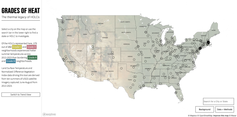
- Historical Context: During the 1930s, the Home Owners’ Loan Corporation’s redlining policies discriminated against minority neighborhoods, leading to long-term economic and environmental consequences.
- Current Impacts: Our analysis shows that, in 150 of 179 major U.S. cities, historically redlined areas experience significantly hotter summer temperatures compared to non-redlined areas. On average, these Grade D neighborhoods are 6.5°F hotter than Grade A neighborhoods.
- Extreme Cases: Cities like Boston, Portland, and Oakland exhibit some of the highest temperature disparities due to redlining, with differences exceeding 12°F.
While redlining isn’t the sole cause of higher temperatures, it exacerbated conditions that made these neighborhoods more prone to becoming hotter over time. Addressing this issue requires targeted interventions, such as planting street trees and installing cool roofs and pavements.
Explore the Grades of Heat site to interact with maps for 202 cities, delve into detailed local data, and learn more about our methodology and findings.
Key Takeaways from Climate Central’s Report
Climate Central’s study reveals several critical insights about urban heat islands and their effects on American cities:
- Widespread Impact: The entire planet is warming due to human-caused climate change, but cities experience even higher temperatures due to the built environment.
- Detailed Heat Mapping: The UHI index was calculated for every census block group within each city, estimating how much hotter these areas are due to urban characteristics.
- Visualizing Hot Spots: The report includes detailed maps showing urban heat hot spots, ranging from concentrated urban cores, like Cincinnati, to sprawling areas, such as Houston.
- Population Exposure: Nearly 34 million people, or 68% of the 50 million analyzed, live in areas with a UHI index of 8°F or higher. Six cities, including New York and Phoenix, each have over 1 million residents exposed to these elevated temperatures.
- Inequitable Heat Burden: The urban heat burden is not shared equally. The analysis shows a clear link between higher urban heat exposure and historical racial discrimination in housing policies.
News Coverage Highlights
- CBS News (7/10/24) – Minneapolis can get up to 8 degrees hotter than other places in the state, new study finds
- WNYC Morning Edition (7/11/24) – New Research Shows Urban Heat Felt Unequally Across US Cities